As a working professional photographer, I wouldn’t trade my job for any other in the world. I get to travel the world while capturing images of the diversity of cultures, landscapes, foods, events, and wildlife it has to offer. And when I’m not traveling, I have the opportunity to document so many wonderful people and events in my own San Francisco Bay Area neighborhood. Every job, not matter how wonderful, has its challenges. In this digital age, we photographers are often faced with workflow challenges: how do we cull 10,000 images from a big shoot down to a manageable number, post-process the best ones so that they’ll look their best, and distribute them quickly to the client? Today’s post offers one professional’s take on a quick and simple workflow that meets these challenges, delivering wonderful images to the client in a short period of time while (hopefully) preserving the sanity of the photographer.
 I recently had the opportunity to capture two dress rehearsals and two performances of Dance Identity’s annual Spotlight production, showcasing 250 students and company dancers in 22 numbers. I shot nearly 10,000 images, culled them down to about 700, post-processed, and delivered a gallery to the client, all within 24 hours of the final show. Here’s how.
To illustrate the workflow, we’ll use as a case study the annual Spotlight production of local dance school and company Dance Identity. To document their 250 dancers in 22 dance numbers, I shot both dress rehearsals and both performances, as well as capturing dancers backstage and during candid moments. I captured some group shots of all the performers, instructors, and crew. And to get the big picture, I even shot from the catwalks at the top of the theater down onto the stage. In all, I shot nearly 10,000 images, which I culled to about 700 of the best photos, each of which required individual attention in post-processing. I delivered a gallery with these top images to the client within 24 hours of the end of the final show. Needless to say, without an efficient workflow this challenge would have been crushing. Here’s how I did it. The process I share here will be helpful for enthusiast photographers as well as pros. It doesn’t matter whether you’re delivering your images to a paying client or to your friends and family. When it’s crunch time and you have to turn around thousands of images from a shoot very quickly, this is a workflow that gets results.
 Every image is different, but for large-scale shoots it is important to have a workflow that is streamlined so much of the processing can be done in an automated fashion.
Step 1: Culling Your Images
After each shoot, if there’s time before the next one starts, I review and begin to cull my images. There are some advantages to culling on a bigger screen, but to save time during big events like Dance Identity’s Spotlight production, I cull right on my camera’s LCD screen. Sure, some excellent images will be discarded using this approach, but with 10,000 images to get through quickly, it’s impractical to upload all of them to a PC and rank them all in a tool like Lightroom. I zoom in on the images when required in order to get a closer look at focus, facial expressions, etc., and I use the camera’s histogram to check exposure. I delete liberally as I go, keeping only the best images for a second review on the laptop. In the case of the Dance Identity shoots, I culled in-camera from 10,000 down to about 1500 images.
 With so many similar images to choose from, the culling process needs to be quick and dirty. I do it using my camera’s LCD screen, transferring only the best images to the laptop for further culling and processing.
Step 2: Post-Processing
After culling down to a manageable number of images, but ensuring that the selected photos still represent all the dance numbers and all the performers, as well as a range of styles (group shots, motion shots, closeups, etc.), it’s time to post-process. I use Lightroom nearly exclusively as the tool for this job when it’s a large-scale shoot. Lightroom is optimized for the professional photographer’s workflow, and its presets, synchronization tools, and intuitive layout allow photographers to get the job done quickly and properly.
First, I import the selected images into Lightroom, using a preset to automatically adjust white balance, exposure, and noise reduction to the subject, in this case a fast-moving dance performance shot in an indoor theater. For example, I use the import preset and/or synchronization capability in the Develop module to quickly apply noise reduction for all the shots made at high ISO settings (1600 and above).
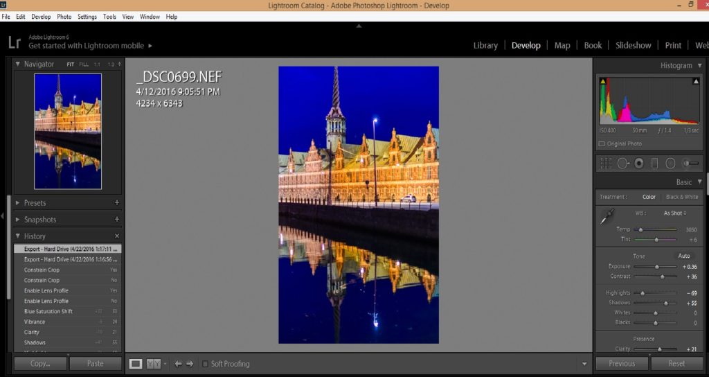
Next, I turn off synchronization and go through each image individually in the Develop module, fine-tuning the settings for that specific image. With many hundreds of images to fine-tune, I can only spend about thirty seconds on each one, so the workflow has to be very straightforward. Typically I use the crop tool first, as this will be required for nearly every image. I use the straightening tool within the crop toolset, selecting a line (such as a line on the stage or the bottom of the theater’s curtain) that I want to align with the top and bottom of the image. Then I crop the image to highlight the subject in the most powerful way. Sometimes I turn off the aspect ratio lock and set the image’s proportions manually, but most of the time I try to work with the aspect ratio as shot in the camera. After straightening and cropping the image, I do some fine adjustments on the exposure and color settings, and then apply any needed effects such as post-crop vignetting or conversion to black-and-white. Rarely, I may have to apply some selective adjustments such as brightening just one part of the image or removing a distracting background, but this slows down the workflow and should only be used when required.
 Each image should be quickly straightened and cropped, then color and exposure settings (like the black point in the image above) can be applied to show the subject most effectively.
Step 3: Delivering the Final Images
Once all the selected images have been processed, it’s time to deliver them to the client. It can save time and simplify the workflow to use Lightroom’s Publish module to send your images directly to the platform you plan to use to deliver them. My website is powered by SmugMug, which integrates well with Lightroom. However, in the case of the Dance Identity shoots, I exported the top images to my PC’s hard drive, then uploaded the files from there to a new gallery on my website. It’s your call as to which method you like to use. In either case, once your final image files have been uploaded to your platform, it’s a good idea to apply security settings such as watermarking, right-click protection, and passwords to protect the images from misuse. This is also the time to apply keywording so that you, your clients, and the public can find the images now and in the future. Finally, communicate the availability of the final images, the access method, and the pricing to your client.
 Delivering your images to a high quality platform quickly is a requirement to meet client needs in today’s world of fast-paced digital media.
So, there you have it: A quick but effective workflow to go from many thousands of raw images down to a few dozen or a few hundred beautifully processed photos, delivered to the client quickly and professionally. And the best part is that you, the photographer, can retain at least some of your sanity in the process. Of course, if you’re preparing fine art images for a major competition or exhibition, you’ll want to labor painstakingly over each one, hand-crafting every element of the image until you get it perfect. But when you’ve got many, many raw images that need to be delivered promptly, this process is a workmanlike way to get the job done!
 Take a bow! You’ve married art with process engineering to deliver high-quality images to your client in a minimum amount of time.
Whether you’re a pro shooting for a paying client or an enthusiast shooting for family and friends, this basic workflow will get your images looking great and in the hands of those who want to see them in the shortest possible time.
What tips and tricks do your use when processing very large batches of images? Please share your suggestions here!
Want to see more posts about image post-processing? Find them all here: Posts about post-processing.

 With just a few minutes of tweaking using Lightroom, I was able to crop the image for more dramatic impact, render a true black background, reduce the grainy noise in the shadow areas, and enhance the saturation of the colors. Buy this photo
 This old Scandinavian stave church was shot as a color image in 2005. It is so high-contrast that it appears nearly monochromatic on the display screen. It’s a striking image, but looking at it today I wondered how much more effective it would be as a true black-and-white photo, so I decided to revisit the image using Lightroom.
 Here’s the same digital image file, but converted to black-and-white using Lightroom’s color channel processing module. I boosted the contrast even further and then adjusted each color’s saturation in the black-and-white mix to achieve the exquisite texture of the snow on the ancient building’s roof. Buy this photo
 Reviewing my favorite images from a recent trip to New Orleans, I saw this shot of a characteristic French Quarter balcony and realized it would be even more powerful if certain colors were more saturated.
 A brief session in Lightroom’s Develop module was all it took to boost the saturation of the blue and red channels and to adjust the shadow and black point tonalities. The resulting image more closely reproduces the emotional experience I recall when viewing this scene live. Buy this photo
 As photographers, we want to ensure the colors in our final images reflect as best we can the original colors we perceived when first framing the scene. With proper color-calibration of the display screens we use to process our images, we can keep the colors as true and accurate as possible.


 This HDR image of Lago Grey with its glacier and the peaks of Torres del Paine National Park in Chile was processed using Photoshop’s HDR tools. The colors appear unnaturally saturated and parts of the image (especially the tops of the mountains and the brush in the foreground) show some ghosting effects.
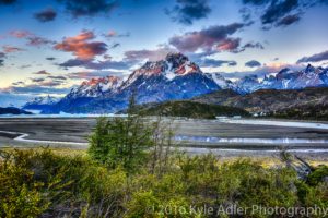 This version was processed using the Nik Collection’s HDR Efex Pro tools. The colors look much more natural and all parts of the image appear sharp and free from ghosting.