Those of us who live in the San Francisco Bay Area can count many blessings, but one I am most thankful for is our fairly close proximity to Yosemite National Park. The second oldest national park in the US, Yosemite is a photographer’s dream. Since the days when Ansel Adams helped make the park famous through his masterful landscape photography, shutterbugs of all stripes have been flocking there to try to capture some of its indescribable beauty. Most of us will never be an Ansel Adams, but that doesn’t stop me from returning to Yosemite at least once per year to give it my best shot, as it were.
Without doubt, there are many iconic views in the park that are relatively easy for even novice photographers to render. There is majesty in the panorama over Yosemite Valley as seen from the famous Tunnel View lookout. One doesn’t even have to venture off the main park road to shoot a nice image of Half Dome or El Capitan. But Yosemite offers so much more to the photographer who’s willing to look a bit more closely, to hike a little instead of jumping out of a car to shoot, or to come to a spot at unusual times, including the middle of the night.
In this post, I’ll share a few images I made in Yosemite National Park over the past year, but none of them will be a postcard-type shot that you’ve seen 1000 times before. And we’ll talk a bit about how to find and capture these less discovered views.
While hiking in the Tuolumne Meadows area, 5000 feet above Yosemite Valley, we were caught in a freak hailstorm at the remote Dog Lake. Instead of throwing a rain cover over my gear and running for shelter like a normal person would do, I set up my kit and started shooting. This image plays off the contrasts between the peaceful and violent sides of nature and between the light and the shade. It is a composite of several different shots made at different exposures, put together in Lightroom’s HDR (high dynamic range) merging tool.

Yosemite offers unusual and dramatic views to those willing to get away from the roads and brave some harsher conditions. Buy this photo
Another less-visited attraction in the park is the wonderful Chilnualna Falls. The lower waterfall is actually quite an easy hike from the parking area at the trailhead, and its little swimming hole makes for a refreshing break on a hot summer’s day. Here’s a shot of my younger daughter enjoying a dip in the swimming hole just under the falls. To blur the water, I used a slow shutter speed, which could only be achieved in the harsh mid-day light by attaching neutral-density filters to the lens. Neutral-density (ND) filters are an essential accessory for the landscape photographer, because they block most of the available light from reaching the camera’s sensor, allowing you to use a slower shutter speed to blur motion and/or a wider aperture to throw the background out of focus.
These reduce the amount of light that reaches the camera’s sensor, so you can use slower shutter speeds to blur motion, or so you can use a wider aperture to get a shallow depth-of-field, even in bright sunlight.

A neutral-density filter allows a nicely blurred shot of the waterfall at Chilnualna Falls. Buy this photo
Another lovely hike in the high country of Tuolumne Meadows is Cathedral Lakes. On our way back from these pristine and remote lakes, we passed this granite rock dome. I used a polarizing filter on a wide-angle lens to bring out the details on the surface of the rock and to lend more drama to the sky. Then, in post-processing, I converted the image to black-and-white to emphasize the remarkable texture of the granite slab’s surface. For more discussion about converting images to black-and-white, take a look at my earlier post: B&W Photography post.

Using a polarizing filter can darken and add drama to skies, reduce unwanted reflections, and render stunning detail on shiny surfaces. Converting an image to black-and-white can bring out the textures and patterns that may be less prominent when viewed in a color image. Buy this photo
Just because a place is glorious in its own right doesn’t mean we can’t include people in our photos. Putting humans in a landscape adds a personal touch, provides a sense of scale, and often tells a more compelling story than would an image of the same place without people. Here I’ve included my daughters in a landscape from the incomparable summit of Sentinel Dome.

Including people in landscapes layers a human narrative on top of the natural story. I like the added color, and humor, from the addition of my daughters in their college logo hats. I’ve chosen a wide aperture to soften the focus on the lovely background. Buy this photo
You don’t have to stop shooting when the sun sets. Some of the most wonderful images of Yosemite are made after dark. I came to this spot not far from the edge of the meadow in Yosemite Valley, and right on the bank of the Merced River, quite late at night when the sky was very dark. I set up my camera and wide-angle lens on a tripod and made a 25-second exposure at a high sensitivity (ISO) setting. The resulting image shows the spectacle of the Milky Way arched above the terrestrial grandeur of Half Dome and other Yosemite landforms. For more discussion of capturing the Milky Way, visit this post: Milky Way photography post.

A favorite image of mine: The Milky Way above Half Dome. Note that not every landscape image needs to be in “landscape orientation”. Buy this photo
Next time you are fortunate enough to visit Yosemite National Park, try to discover some new places, visit favorite places less visited times of the day (or night), and include some people for a human component to the story. Your images will stand out from the millions of others made in this glorious park!
Do you have a favorite photographic experience from Yosemite to share? Please leave a comment to let us know.
Want to see more posts on great travel photography destinations? See them all here: http://www.to-travel-hopefully.com/category/destinations/.

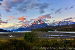 This HDR image of Lago Grey with its glacier and the peaks of Torres del Paine National Park in Chile was processed using Photoshop’s HDR tools. The colors appear unnaturally saturated and parts of the image (especially the tops of the mountains and the brush in the foreground) show some ghosting effects.
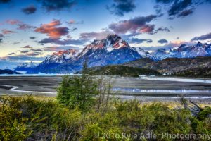 This version was processed using the Nik Collection’s HDR Efex Pro tools. The colors look much more natural and all parts of the image appear sharp and free from ghosting.


![I See a Red Door and I Want to Paint It Black [Encore Publication]: When a black-and-white image is better than color, and how to convert to B&W](http://www.to-travel-hopefully.com/wp-content/uploads/2016/08/LR-9763-1200x801.jpg)


