
Back in the day, a photographer had to choose in advance whether to shoot with color film or black-and-white film. Conversions from color to B&W were cumbersome and expensive, and conversions from B&W to color were essentially impossible. During the film era, I typically shot exclusively using color transparency film while traveling, and reserved B&W photography for particularly artistic shoots near home.
Thankfully, in today’s digital world, we no longer have to commit ourselves in advance to monochrome vs. color images. It’s now a simple procedure to convert our color images to B&W during post-processing. And that’s a great blessing, because there are plenty of times when a black-and-white photo is better than a color photo.
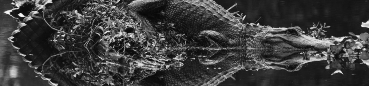
Consider the image of the alligator at the start of this post. One of my favorite photos, this one works just fine in color, too. But the real power of the image is revealed in B&W through the striking textures of the alligator’s skin as seen above the water and as reflected off the water’s surface. The background above the water fades to a deep, nearly true, black, with the background of the water itself rendered slightly less darkly and showing some nice ripples of motion. Black-and-white photography is especially powerful when there are contrasts of pattern, texture, and background as in this image. Buy this photo
When else might we want to render an image in B&W?
Portraits made in monochrome have a timeless look that evokes the earlier years of photography, and this rendering can also bring out the true nature of the subject. There’s a lovely look to the skin tones and hair when displayed in B&W, and there are fewer distracting elements from the color of clothing or background objects.

This portrait takes on a vintage, timeless look when shown in B&W. Our eye can focus on the model’s face and hair without the distractions of the colors in her sweater or the building. There’s almost a street photography kind of documentary quality to this image in monochrome that is lost when viewed in color. Buy this photo
Color can be distracting in an image where we want to emphasize the essence of a person or place. In this portrait I made recently for a couple who are fellow musicians and friends of mine, we had beautiful “golden hour” light to work with, and the background and clothing worked well in color. But converted to B&W, this image really places the emphasis on the couple without the distractions of the color cast in the reflections off the eyeglasses or of the mixed lighting in the background.

In this portrait, black-and-white presentation places the viewer’s attention squarely on the the couple and their instruments, without distractions from the multiple colors of the clothing and background components. (Client photo not available for purchase.)
When you’re shooting under “mixed lighting”, which means there are multiple light sources with different color temperatures (i.e., some light sources are warmer and others are cooler), converting the image to B&W can be a real problem solver. Consider the image below, made in Bruges at night. The light from the street lamps was warmer than the light coming from the spotlights on various buildings, and there was also a bright moon that night, so when seen in color the photo would look less appealing due to the contrasting of the color temperatures in the different parts of the image. But viewed in B&W, it brings out the grandeur of the old buildings and the beauty of the reflections in the waters of the canal, without the distractions of the color casts.

This image of Bruges at night, when processed in B&W, removes the contrasting color temperatures of the multiple different light sources and allows the viewer to enjoy the stately old buildings with consistent tone and texture. Buy this photo
Now that we’ve covered a few of the many situations in which a black-and-white image is preferable over a color image, let’s look at how to convert from color to B&W. There are many ways to perform this conversion, but I recommend it be done using the Color Adjustments settings in the Develop module of Adobe Lightroom. Here’s how:
Click on the “B&W” tab above the individual color channel sliders, and then adjust the mix of how the colors are blended by increasing or decreasing each color’s slider to see how the black-and-white image looks. I find that I often have to readjust the contrast slider at this point to get the image looking its best in black-and-white.
For more on using Lightroom to post-process your images, check out my previous post: Previous post on using Lightroom to post-process images.
I do not recommend using your camera’s built-in black-and-white mode, as you will then lose the color information in the image file. I also do not suggest using the settings some cameras have to make a copy of the image in B&W, because in most cases the camera’s built-in software will not do a very good job of rendering the image in monochrome. For the best results, either use Lightroom or a dedicated black-and-white conversion application such as Silver Efex Pro 2 from Nik Software, which is available as a plug-in for Lightroom or Photoshop.
Want to read other posts about travel photography techniques? Find them all here: http://www.to-travel-hopefully.com/category/techniques/
What do you love about a black-and-white image? When do you convert an image to B&W rather than share it in color? Any tips or tricks for how to make great B&W photos? Please share your thoughts in the comment box!