
Photographic composition is the process of determining which elements to include in the image and how to combine them in an artistically pleasing way.
What makes a great photograph? You’ll hear many different answers to this question from different people, but to me a great photograph needs to integrate at least three of these four elements: compelling subject, beautiful light, flawless technical execution, and thoughtful composition. Assuming we can find a great subject and either find or manufacture lovely lighting, the technology in modern cameras can assist us in certain technical matters such as exposure and focus. But even the best of today’s AI technology can’t replace the artist’s vision when it comes to photographic composition. For more of my musings on the application of AI to photography, see yesterday’s post: Post on AI and Photography.
Today’s post presents a quick primer on some of the guidelines that can help us compose our images. But keep in mind that there are no hard-and-fast rules when it comes to composition. The photographer must choose which “rules” to use when composing, and when to break some rules.
-
-
- Rule of Thirds: One of the first compositional tools most beginning photographers learn is the so-called Rule of Thirds, which states that strong composition is achieved by placing key elements along the imaginary lines that divide the frame into thirds vertically and horizontally; better yet, try to place the most important parts of the subject at the intersection of a pair of these lines. This portrait I made of two sisters in Arusha, Tanzania, places each sister’s dominant eye at an intersection point of two of the imaginary dividing lines.
-

-
-
-
-
- Leading Lines: Another tool to aid in composing strong images is using the natural lines in the image to draw the viewer’s eye into the frame. This landscape made while hiking part of the Sheep’s Head Way in southwestern Ireland incorporates the leading lines of the ancient stone wall, the rainbow, and the coastline to draw the eye down to the sea, over the rainbow, and across the coast.
-
-
-

-
-
-
-
- Framing Elements: Using natural frames within the image to set off the main subject can be a useful technique. Look for doors and windows in a population center, or for natural arches, trees, and other landforms in a natural setting. This night landscape made in Yosemite National Park frames the Milky Way within a ring of trees and granite walls.
-
-
-

-
-
-
-
- Point-of-View: Think about how the different elements in the image will appear in the perspective of your location. I could have shot this portrait of a man with his duck at a street fair in San Francisco straight on with them both looking into the lens. Instead, I chose a viewpoint that was very close to the duck’s head, shooting up from its perspective and relegating the human to the background and edge of the frame, nearly out of focus. This changes the nature of the portrait to a more humorous and offbeat tone, which matched the occasion of the How Weird Street Faire.
-
-
-

-
-
-
-
- Background: Always be at least as aware of your background as your foreground subject matter. Careful choice of background to support your image’s overall theme is one of the surest ways to elevate your image. In many cases it is desirable to have a clean, uncluttered background, but for this image of the San Francisco Pride Parade, I wanted the background to support the theme of solidarity and strength in numbers. While the main subject in the front is the only element in crisp focus, the layers of marchers with flags behind him supports the concept he is not alone.
-
-
-

-
-
-
- Patterns: Composing an image around a recurring pattern can add considerable dramatic impact. I framed this image of miners’ cottages in Svalbard, Norway by isolating the repeating pattern of houses, each in a different vivid color, against the stark white of the snow and bleak sky.
-
-

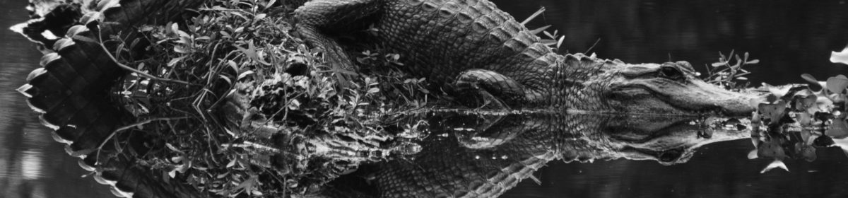
- Symmetry: Images with symmetry along one or more dimensions are often striking and artistically pleasing. The subject can have natural symmetry, such as in a face, or can be framed with its reflection to create symmetry. I framed this image of a resting alligator with its reflection in the Louisiana bayou waters to create a dramatic symmetry.

Keep these guidelines in mind as you choose how to compose your images, but remember that which one(s) you apply will depend on the image, that its okay to break the rules, and that ultimately you are the artist and what you envision, not what the rules state, is correct for you.
What guidelines help you compose your best images? Please share your thoughts here.
Want to read more posts about photographic techniques? Find them all here: Posts on Techniques.

